Objective
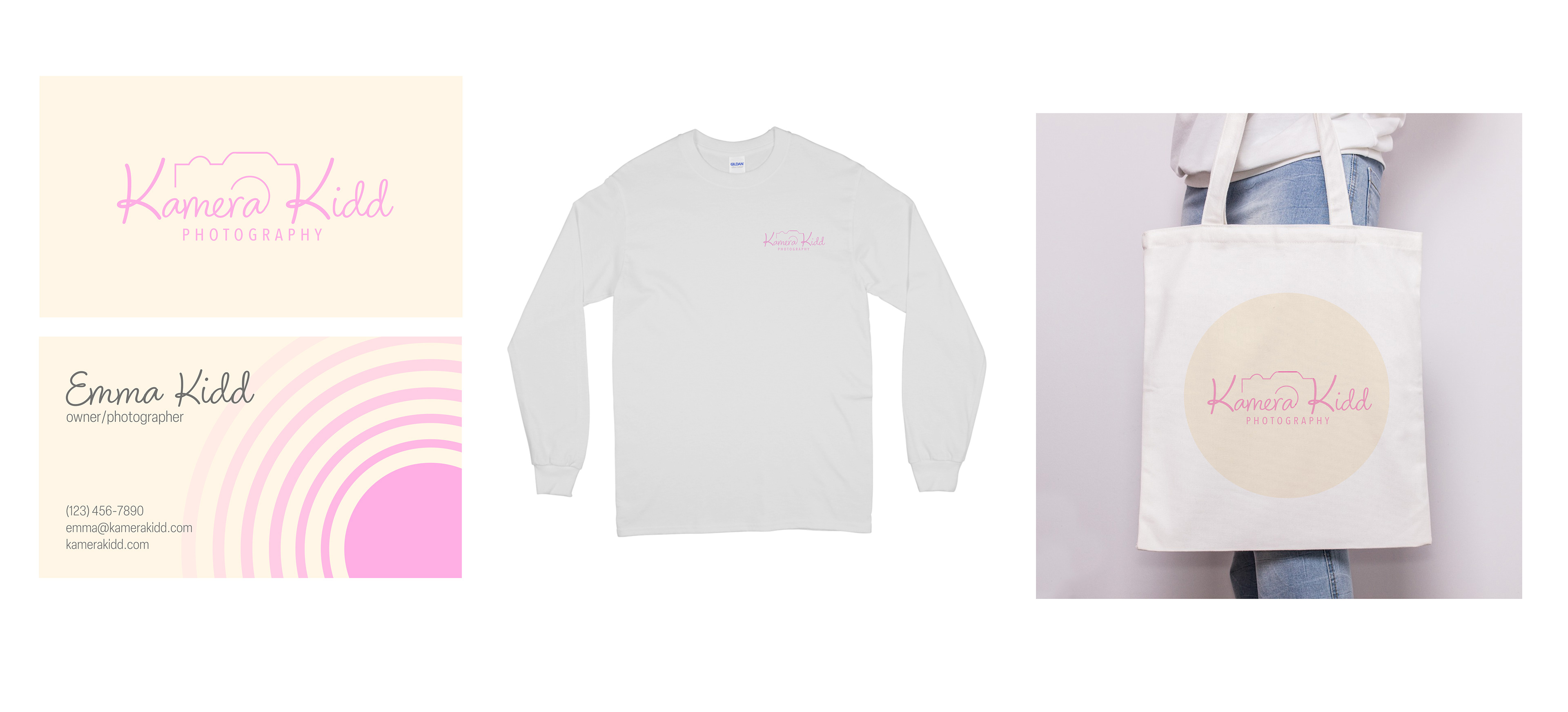
The goal of this project was to develop a clean, artistic logo for Kamera Kidd, a photography brand. The logo needed to function across all visual identity applications—print, digital, and merchandise—while conveying creativity, professionalism, and a contemporary aesthetic.
Research
An initial research phase focused on analyzing logos from existing photography brands, both boutique and commercial. This helped identify common visual motifs, such as camera silhouettes, apertures, and typography trends. Conversations with the client further clarified their preferences, highlighting a desire for a unique yet minimal mark that avoided overused visual clichés.


Sketches
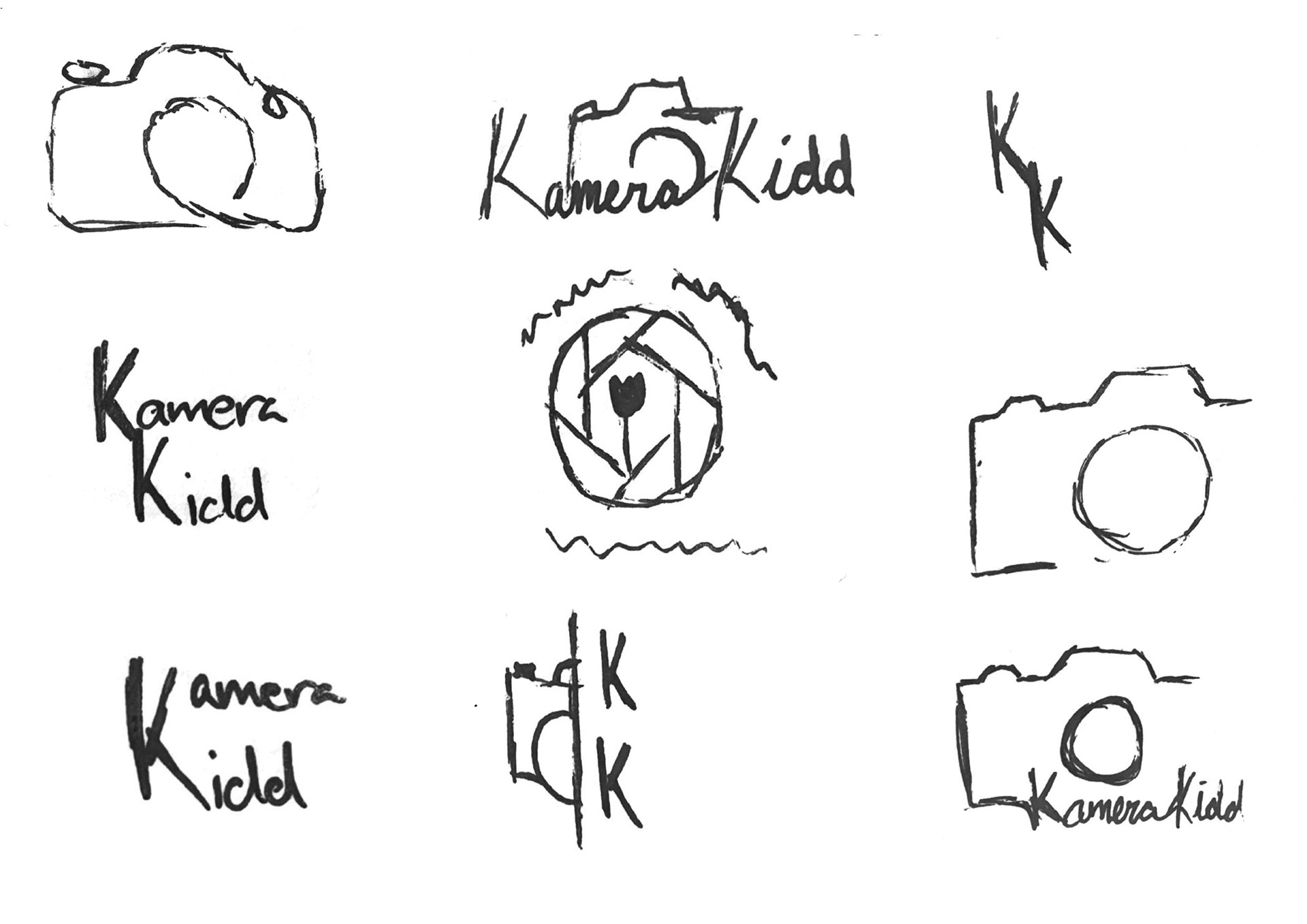
Building on the research insights, a series of exploratory sketches were developed. These focused on abstracting camera elements, experimenting with type integration, and exploring different compositions that balanced simplicity with artistic flair.
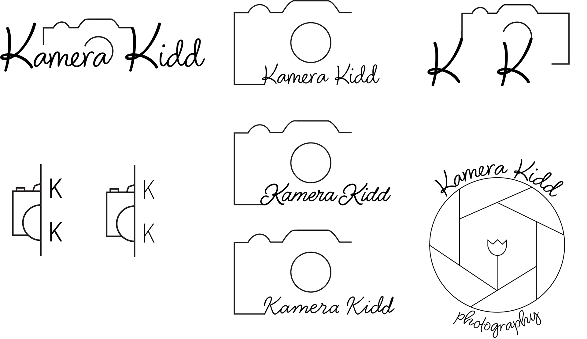
Iteration
Select sketches were digitized and refined through several rounds of iteration. I explored variations in typeface, layout, iconography, and stylistic details. This process involved testing different visual tones, from playful to professional, to find the right voice for the brand.
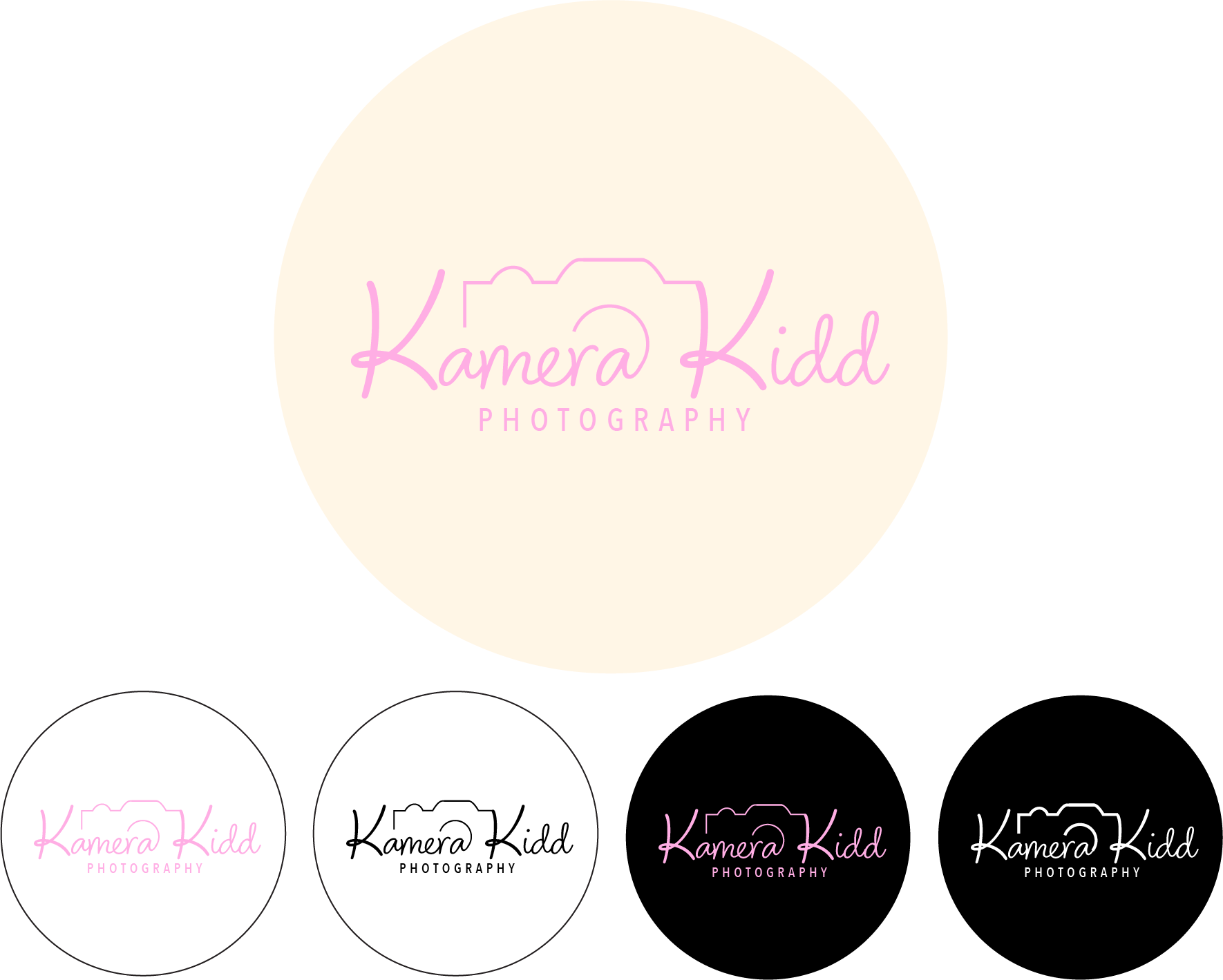
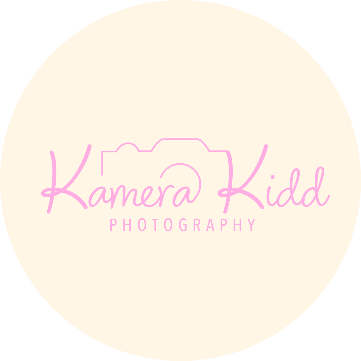
Final Logo
The final Kamera Kidd logo strikes a balance between minimalism and creative expression. Clean lines, thoughtful typography, and camera-inspired elements work together to create a versatile mark. The design is both distinctive and adaptable, ensuring strong brand recognition across platforms and media.