Objective
The task given in class was to choose an animal and represent it as a stylized graphic interpretation, using a blend of geometric shapes and design fundamentals. The creature would then be integrated into a larger design featuring a phrase selected by the designer. The emphasis was on creating a strong, cohesive design using basic shapes and design principles.
Research
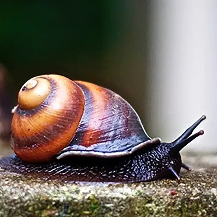
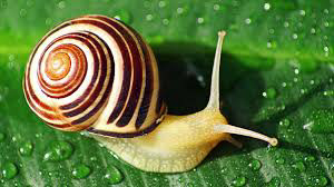
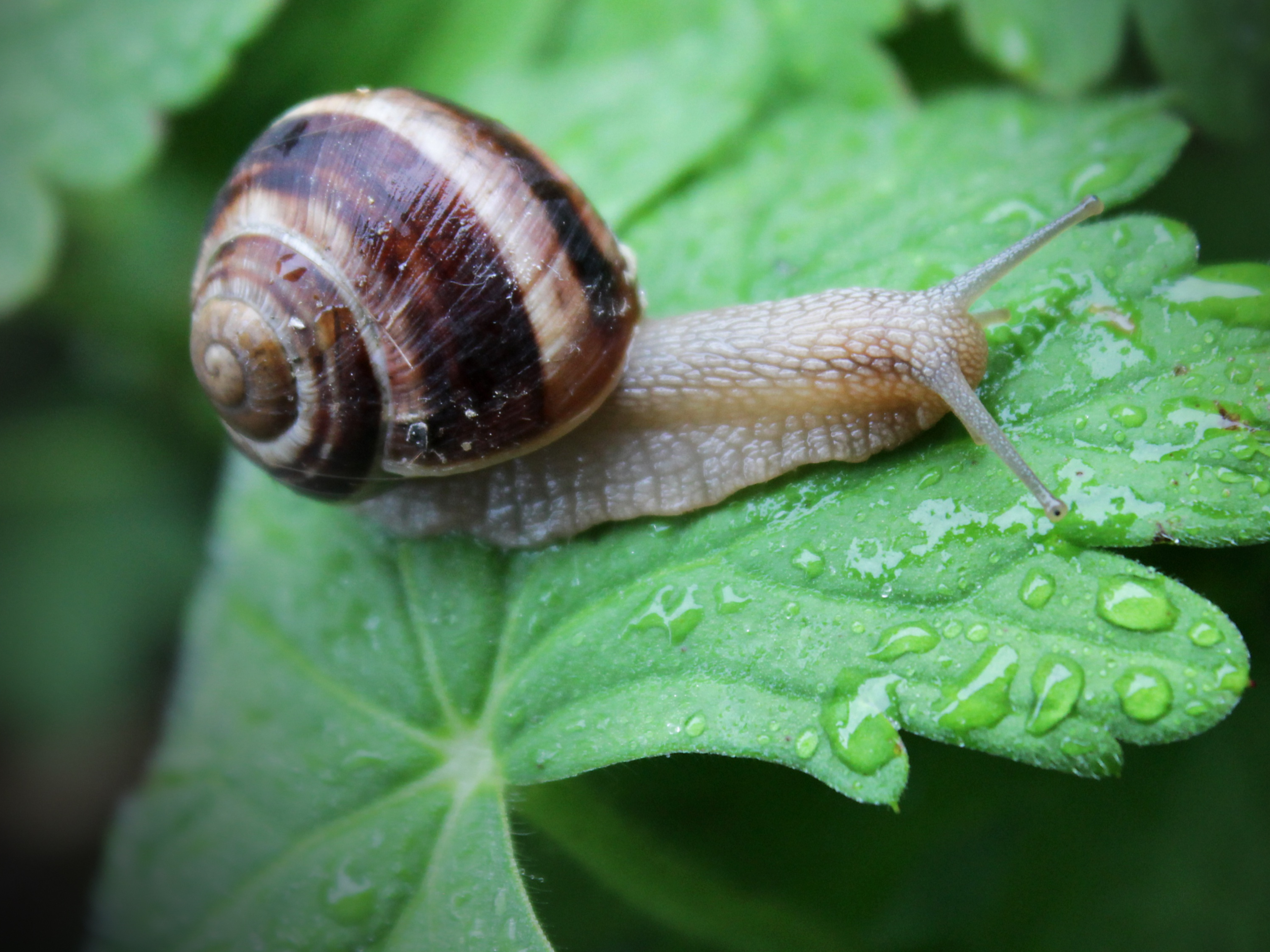
A strong research foundation was crucial in developing my snail creature mark. I studied various snails in nature, focusing on their shell shapes, body structure, and movements. I aimed to capture the essence of their slow yet deliberate nature while ensuring a more stylized and simplified graphic interpretation.
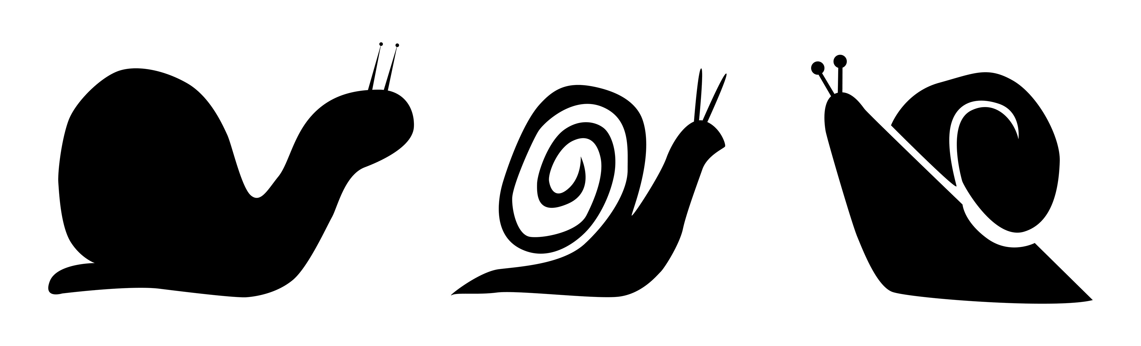
Sketches
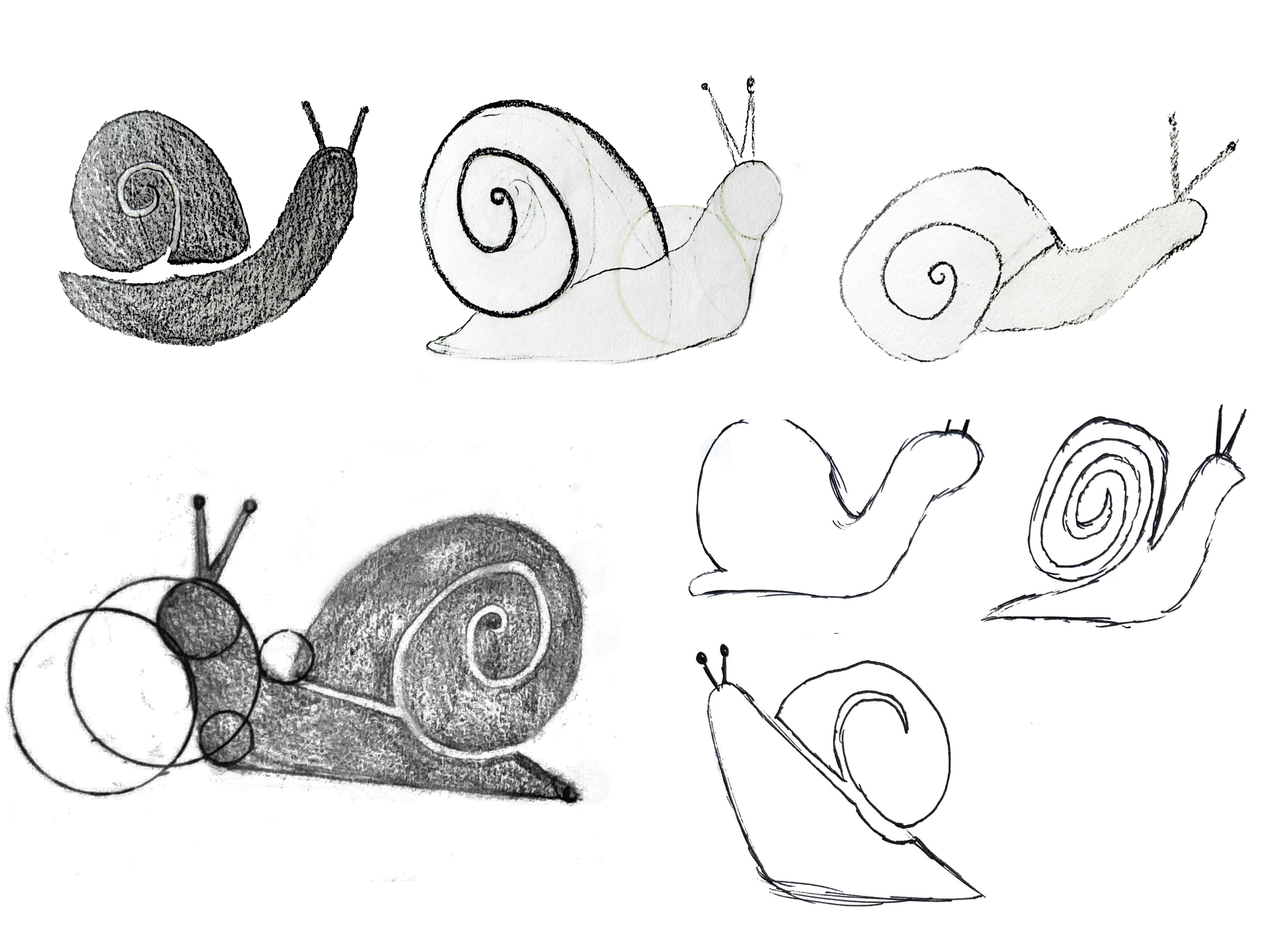
The Shell: How to stylize it to look both iconic and dynamic.
The Body: A fluid and curving design that reflects the snail’s movement.
Character Expression: Giving my creature mark personality through subtle design choices.
Iteration
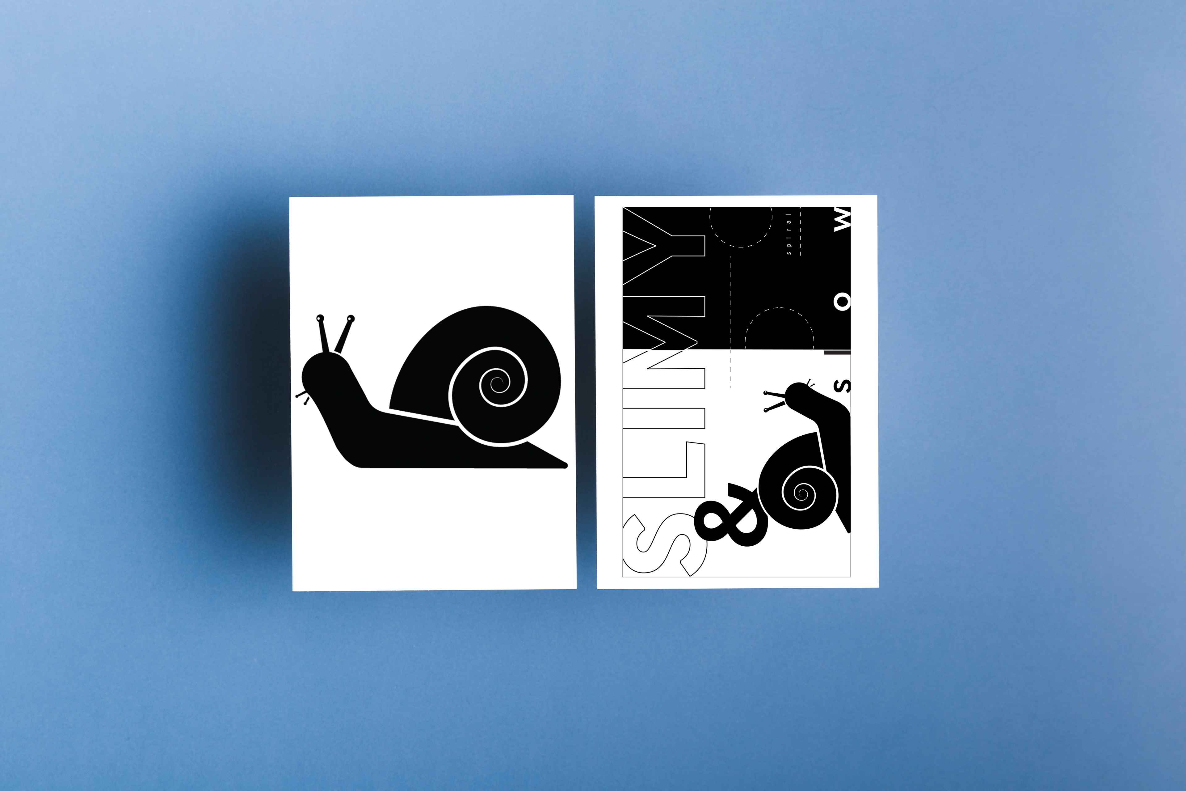
After exploring a range of positions, a side view was selected as the most engaging direction. This view allowed the spiral shell to remain a focal point while giving the snail’s face and antennae room for expression. The curvature of the body and the gradual slope of the form helped ground the composition and create visual rhythm. Geometric consistency in the shell spiral and overall silhouette helped unify the design.
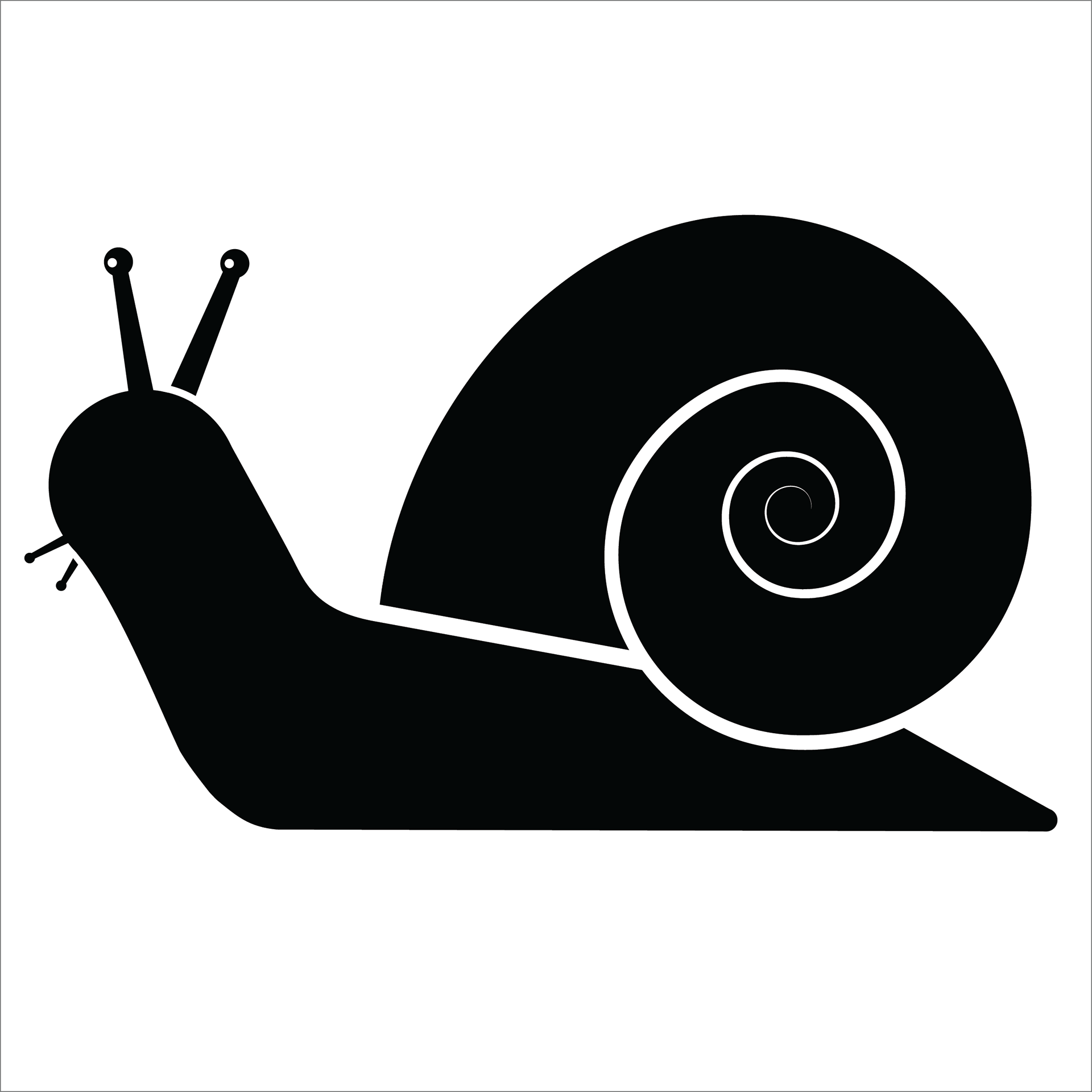
Final Creature
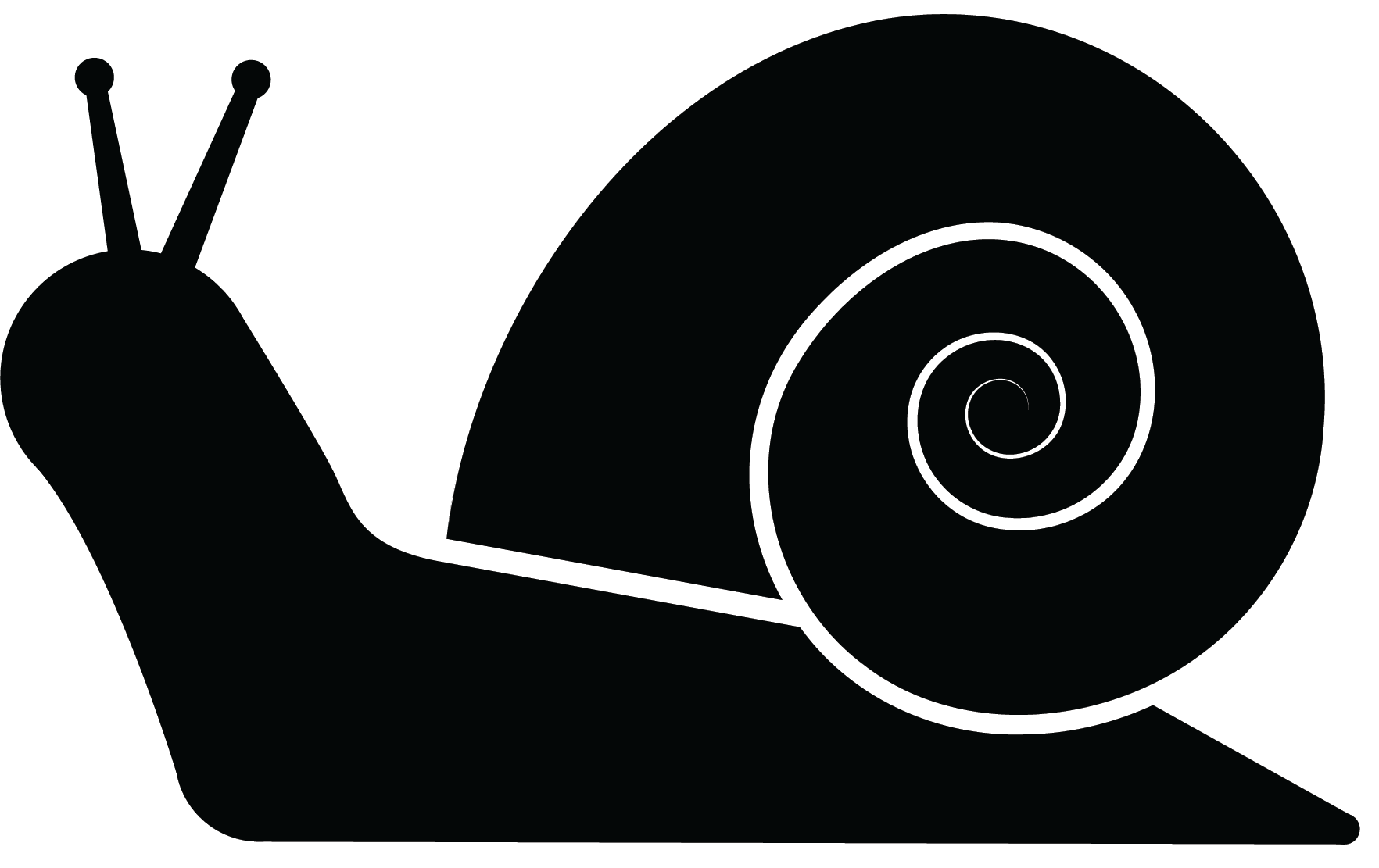
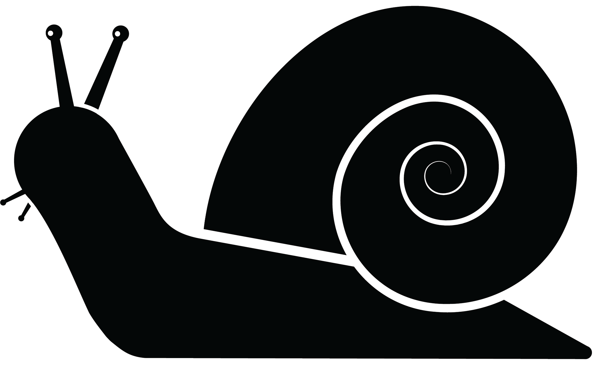
The final rendition of my snail creature mark retained the clear visual hierarchy established in the sketches, with refinements made to shell symmetry, body curvature, and antenna position. My creature mark's expression was developed through minimal shapes that convey curiosity and calm, helping give the character a distinct emotional tone.
Objective II
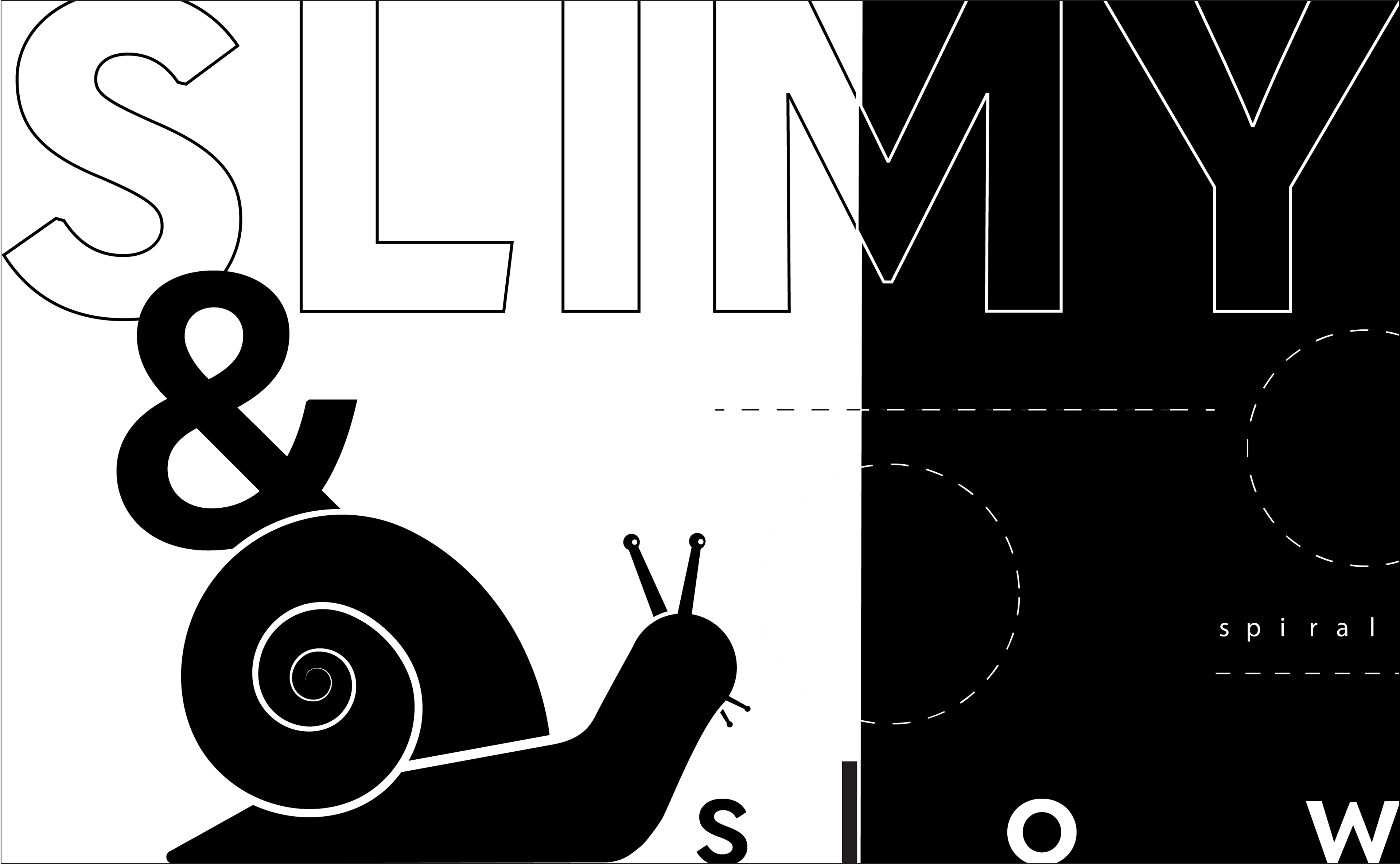
In the second part of the assignment, a phrase was incorporated with the creature to unify the concept. The chosen phrase: “a slow and slimy spiral” It reflects the creature's persistent nature, contemplative energy, and iconic form. It captures the balance between simplicity and depth that characterizes the animal and the design.
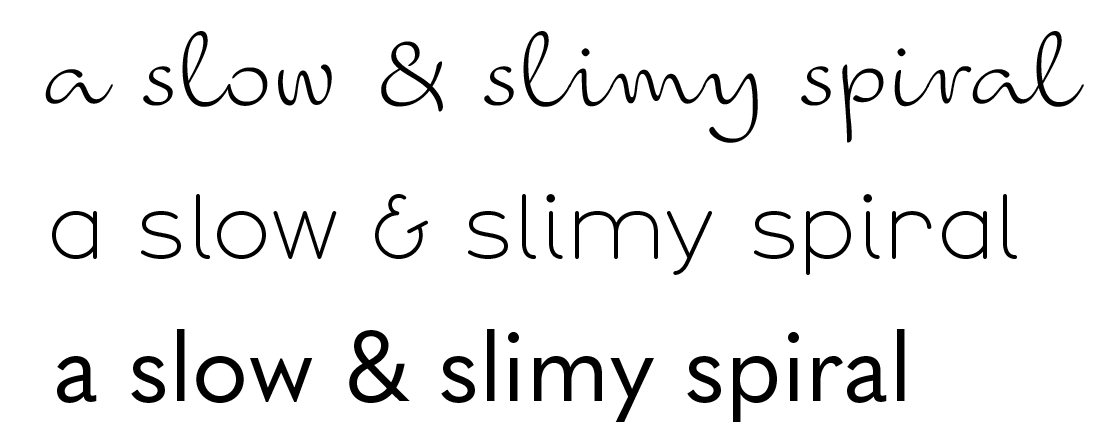
Typeface Choice
Type explorations focused on pairing clean, bold geometric fonts with gentle curves, reflecting the balance in the creature’s design. Several compositions were tested to harmonize the text with the shell spiral, ultimately resulting in a layout that echoes the slow, spiraling journey of the snail.
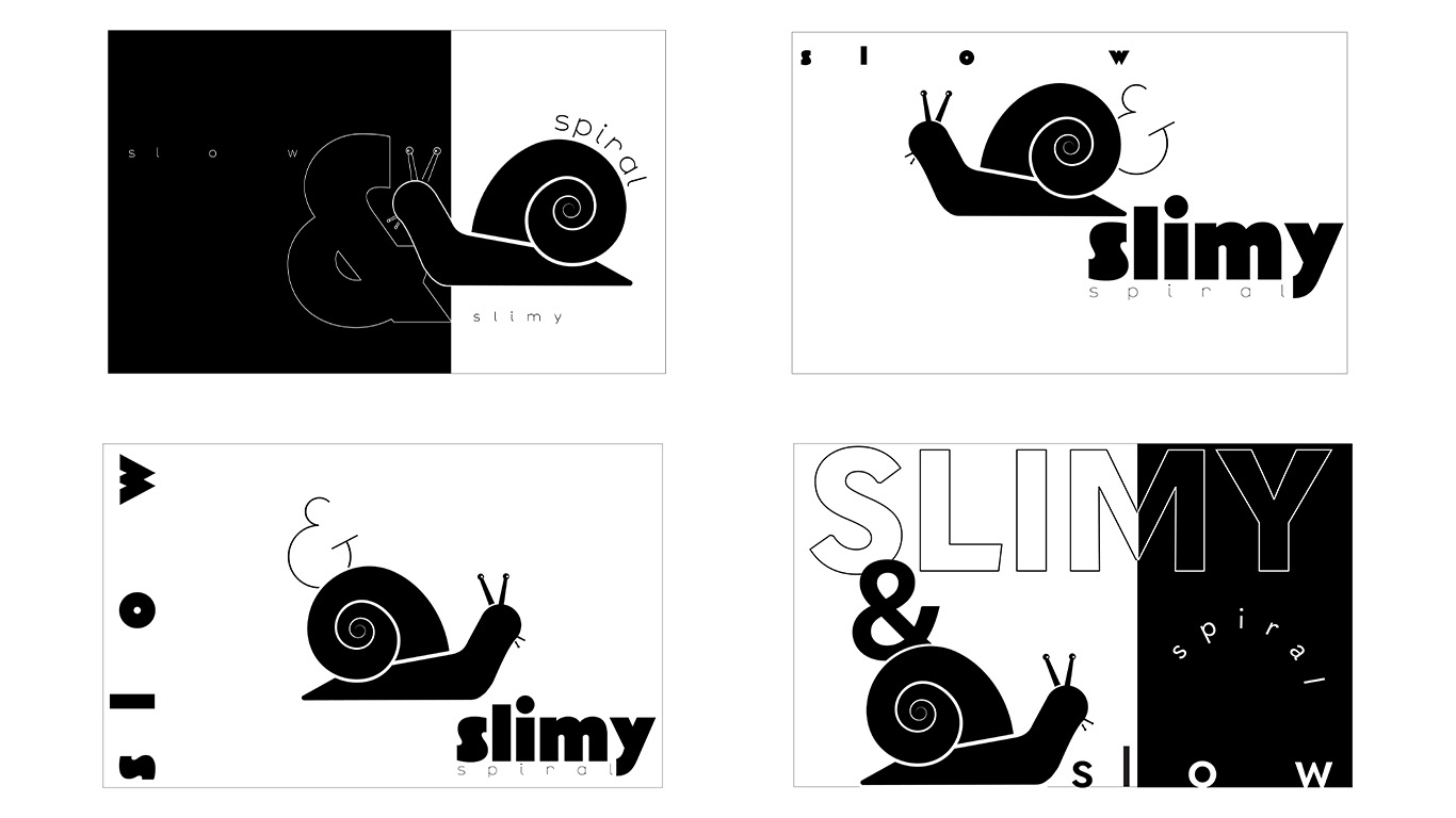
Iteration II
The phrase was integrated by aligning it with the snail’s natural spiral and soft curves. Type placement and font style were chosen to echo the creature’s shape, creating balance between form and text. The layout uses subtle geometry to unify the snail’s personality with the phrase, resulting in a calm but intentional final design.
Final II
The final creature mark and phrase are composed with an emphasis on shape contrast and typographic rhythm. The golden ratio was used to guide the placement of shell, body, and type, creating a visually satisfying composition that highlights the creature’s quiet strength and the intentionality of the design.